
United States: Macro Economic Analysis | Charts – May 8, 2020
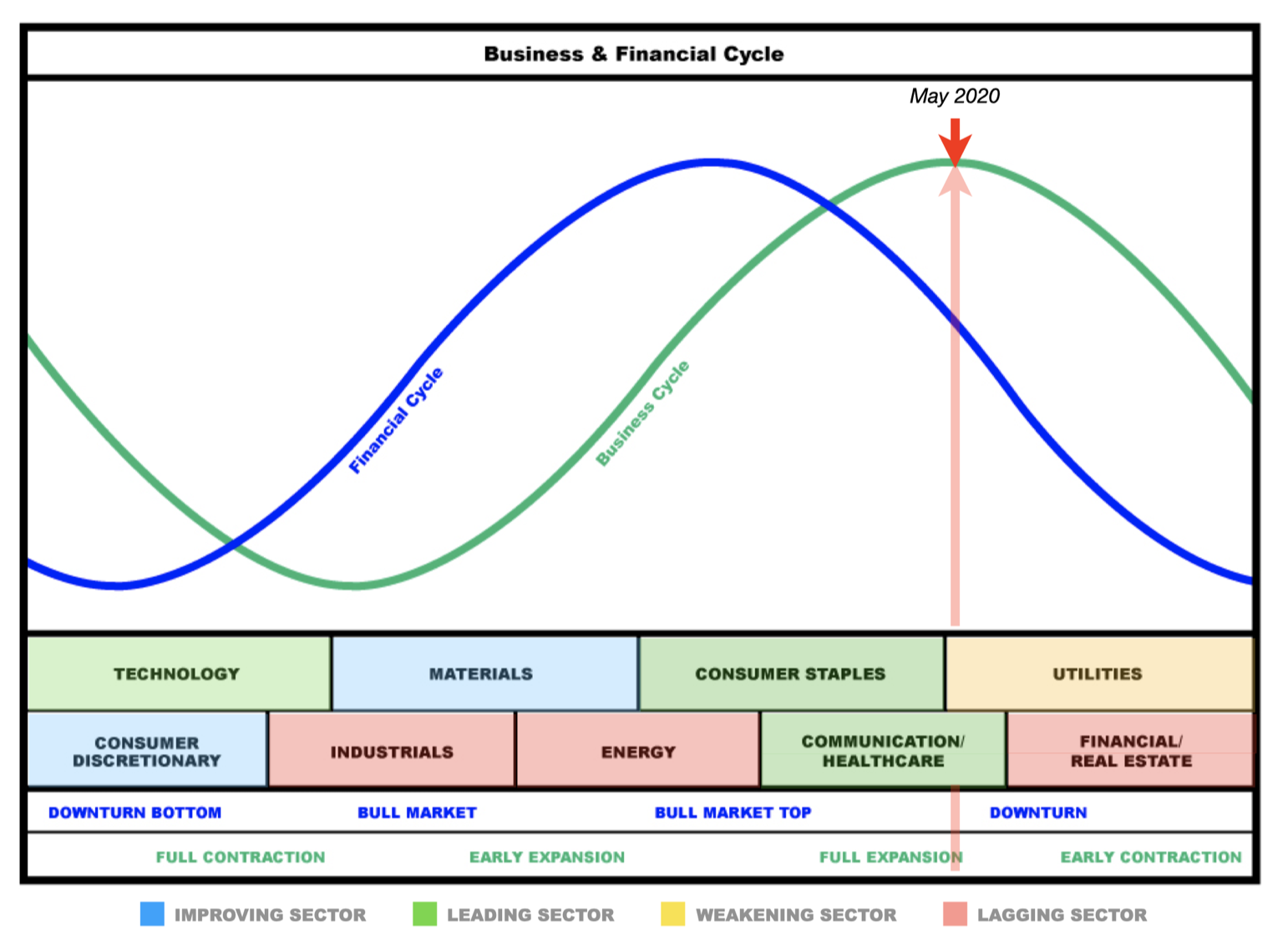
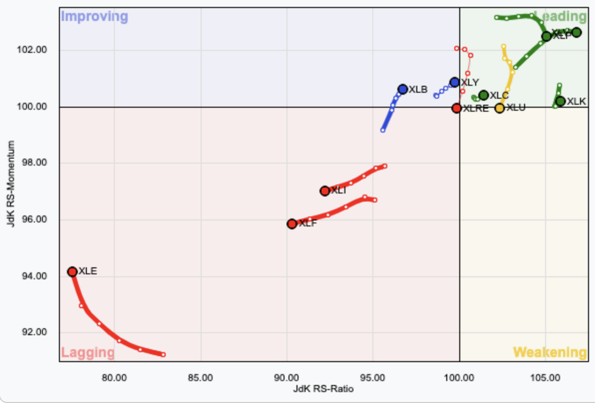
Summary: The business cycle may be on the cusp of full contraction to early contraction. The financial cycle is in a downturn. Sectors which may be expected to outperform in coming months may most likely be utilities, financial, real estate, technology and consumer discretionary. However, RRG charts for utilities, real estate and financial sectors shows a current decline and so they may be weaker than expected. Energy shows a reasonable improvement recently and should also be watched carefully.
Click chart to enlarge.LEADING INDICATORS
STOCK MARKET
Click chart to enlarge. Source: BarChart. Updated daily.
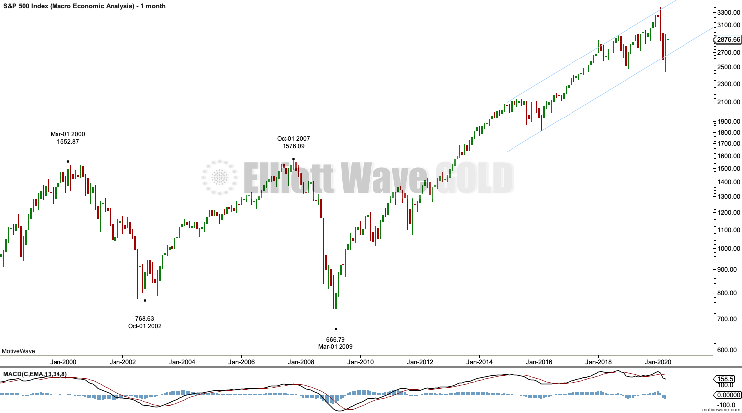
A strong breach of the parallel channel, which contains the latter part of the last bull market, indicates a trend change. Price has dropped 34% of market value (on a closing basis) from the high in February 2020, which exceeds the technical definition of a bear market (20% drop in market value). Currently, a bear market is in place for the US indices.
Bear markets normally have bounces within them. The last two bear markets noted on this chart had early bounces that retraced 73% (following the high at March 2000) and 89% (following the high at October 2007) of the first fall in price. Currently, a bounce may be underway. So far the bounce has retraced 63% of the fall in price from February 2000 to March 23, 2000. This bounce so far looks like normal market behaviour after a major high.
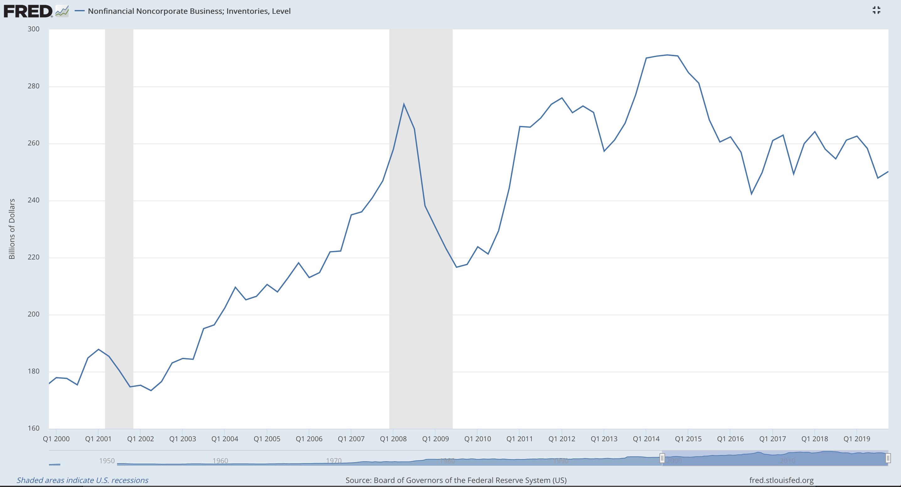
INVENTORY LEVELS
Click chart to enlarge. Source: FRED. Updated quarterly.
Latest data is for Q4 2019.
Increasing inventory may be due to an expectation of an increase in demand in coming months. It may also mean that supply exceeds demand.
Inventory levels peaked in Q4 2014 and have yet to recover to those levels.
Currently, inventory levels have been overall flat since Q1 2017. Latest quarterly data shows a slight increase, but this data is now too out of date to assist in drawing conclusions about the current situation.
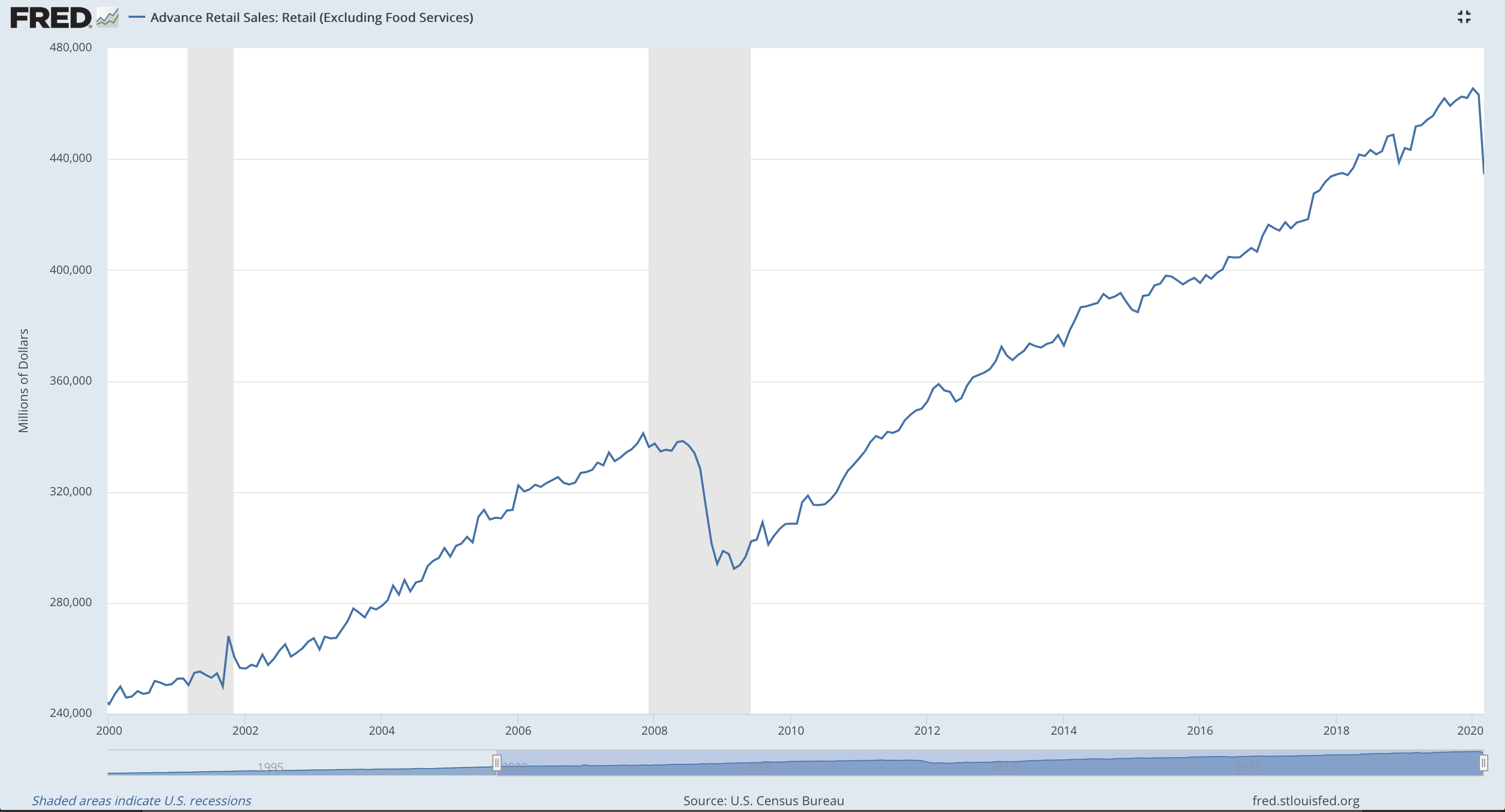
RETAIL SALES
Click chart to enlarge. Source: FRED. Updated monthly.
Latest data is for March 2020
Strong retail sales directly increase GDP, which strengthens the home currency. However, this metric does not account for how people pay for purchases, via cash or debt.
Retail sales show a sharp decline of 6.19% for March. This decline for March is greater in % terms than any decline seen month on month during the last recession of 2007 – 2009.
HOUSING MARKET
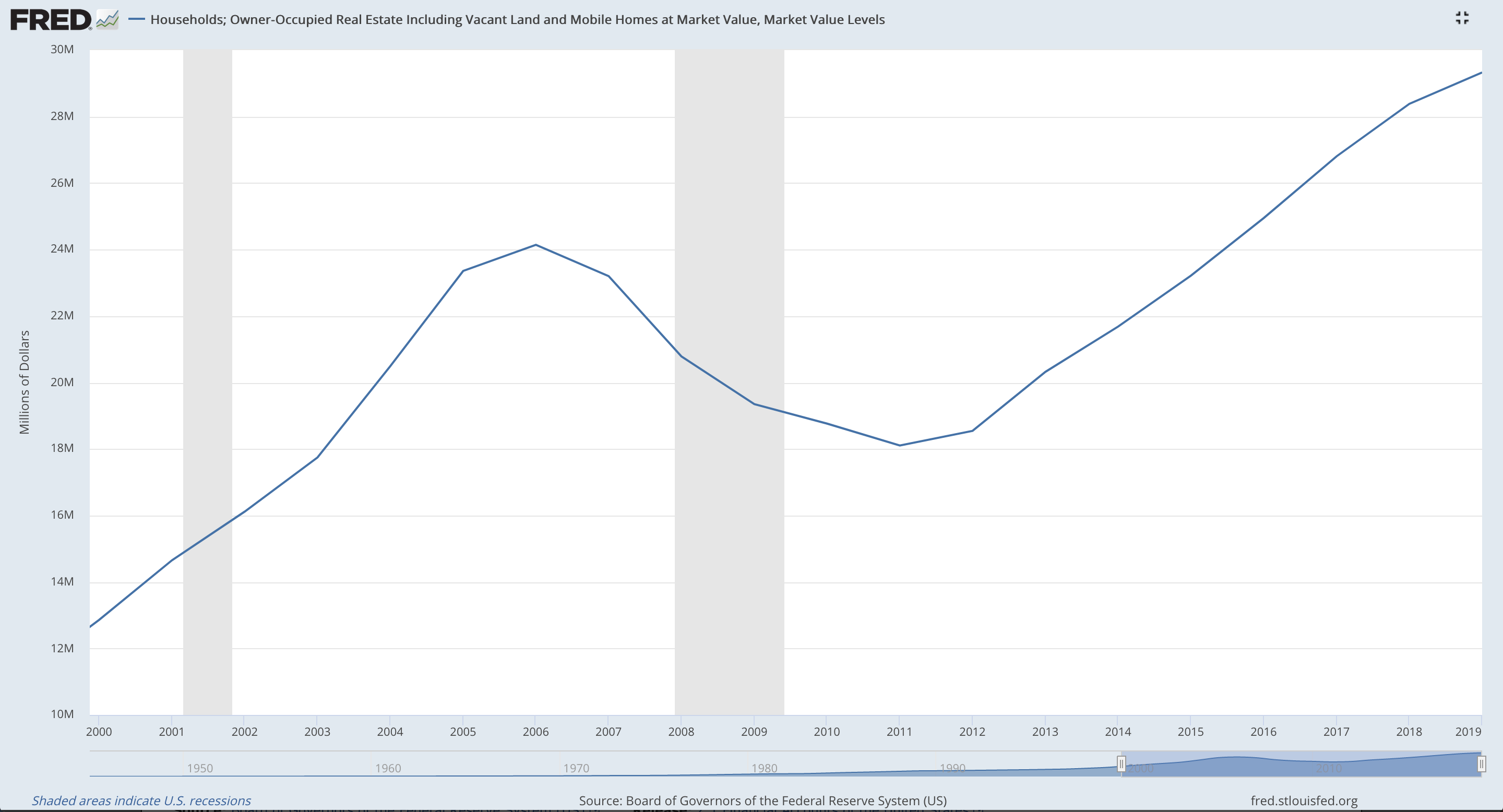
Click chart to enlarge. Source: FRED. Updated annualy.
Latest data is for 2019
Rising house prices usually indicates a stronger economy.
While the housing market is generally expected to behave as a leading indicator, it only did so prior to the last recession of 2008 – 2010 when it declined for two years prior.
New highs were reached in 2019. Data for the current situation will not be available until 2021.
This is a slow moving market.
HOUSEHOLD DEBT AND SERVICING LEVELS
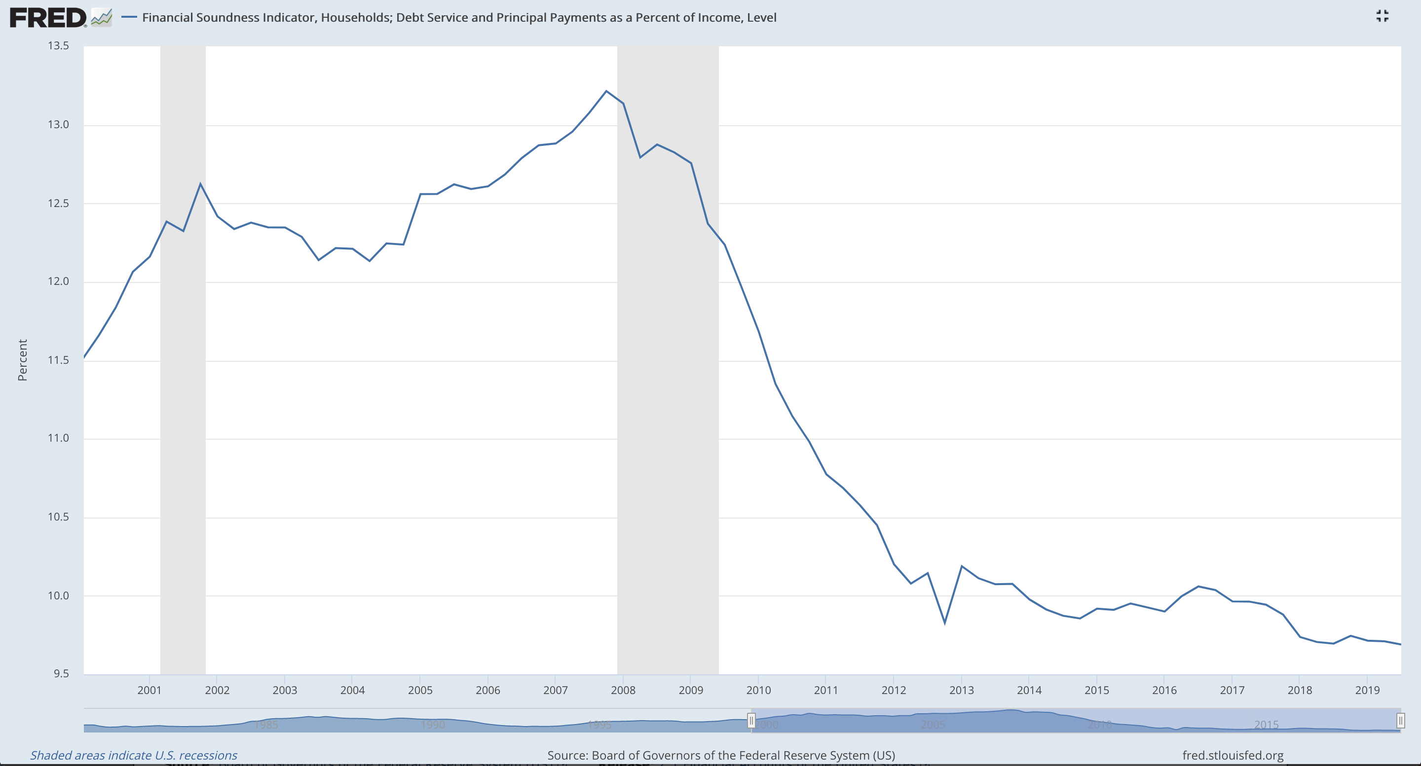
Click chart to enlarge. Source: FRED. Updated quarterly.
Latest data is for Q3 2019.
It is generally expected that rising debt levels put more money into circulation.
Currently, household debt levels are at historically low levels, less than 10% of income levels. This could have a negative effect on economic growth.
CONSUMER DEBT

Click chart to enlarge. Source: FRED. Updated quarterly.
Latest data is for Q4 2019.
Like household debt, it is generally expected that increasing levels of consumer debt put more money into circulation.
Currently, consumer debt is moderate at 5.61 % of disposable income for Q4 2019. The rate is overall flat since about 2016, which may not be very positive for economic growth.
BUILDING PERMITS

Click chart to enlarge. Source: FRED. Updated monthly.
Latest data is for March 2020.
A high volume of building permits issued indicates an active construction industry, more jobs ahead, and an increase in GDP.
Building permits issued for both months of February and March 2020 show a sharp decline, but overall permits have been trending higher since March 2009. That higher trend may be assumed to continue until the last low of June 2019 is broken. At that stage, a lower low would be seen, which is one indication of a trend change.
NON FARM PAYROLL – AVERAGE WEEKLY HOURS
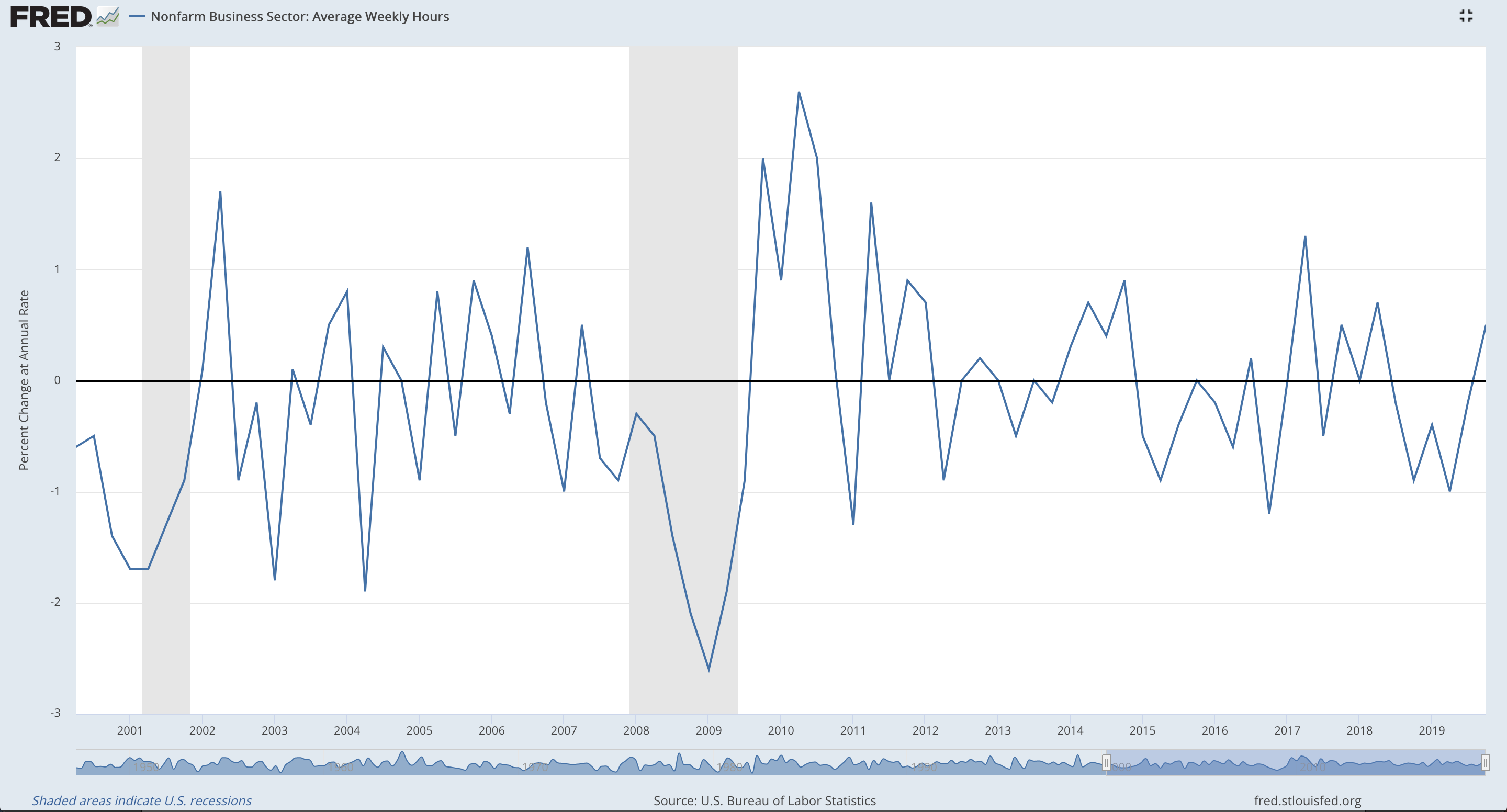
Click chart to enlarge. Source: FRED. Updated quarterly.
Latest data is for Q4 2019.
Increasing hours worked is expected to be a leading indicator of the economic cycle as employers adjust hours worked for existing employees before altering staffing levels.
However, as the chart shows, overall reductions in hours worked (declines below the zero line) are not always followed by periods of recession.
Both Q3 and Q4 of 2019 showed increasing hours worked. This indicates a growing economy.
INTEREST RATE YIELD – 10 YR MATURITY MINUS 3 YR MATURITY
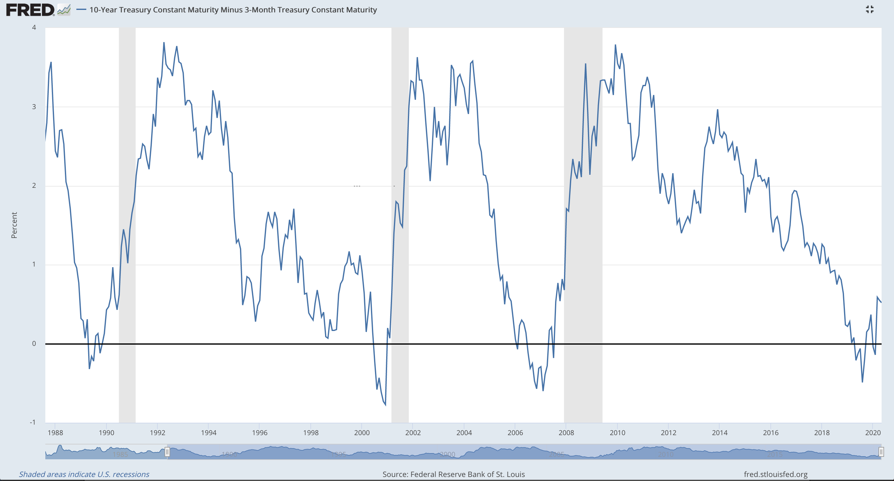
Click chart to enlarge. Source: FRED. Updated daily.
Latest data is for 16th March 2020.
The interest rate yield (10 Yr Rate – 3 Month Rate) is one of the most accurate predictors of downturns in an economy when it becomes negative, i.e. when longer term rates are less than short term rates.
There are examples of three full prior recessions on the chart above:
The first in July 1990 was preceded by a negative yield 14 months prior.
The second beginning March 2001 was preceded by a negative yield 9 months prior in July 2000.
The third beginning in December 2007 was preceded by a negative yield 17 months prior in July 2006.
The interest rate yield moved into negative territory in May 2019 and has returned into positive territory. This suggests a recession may begin in February 2020, at the earliest, to a year or so after this date. The current situation suggests that this prediction may become accurate.
COINCIDENT INDICATORS
INCOME LEVELS
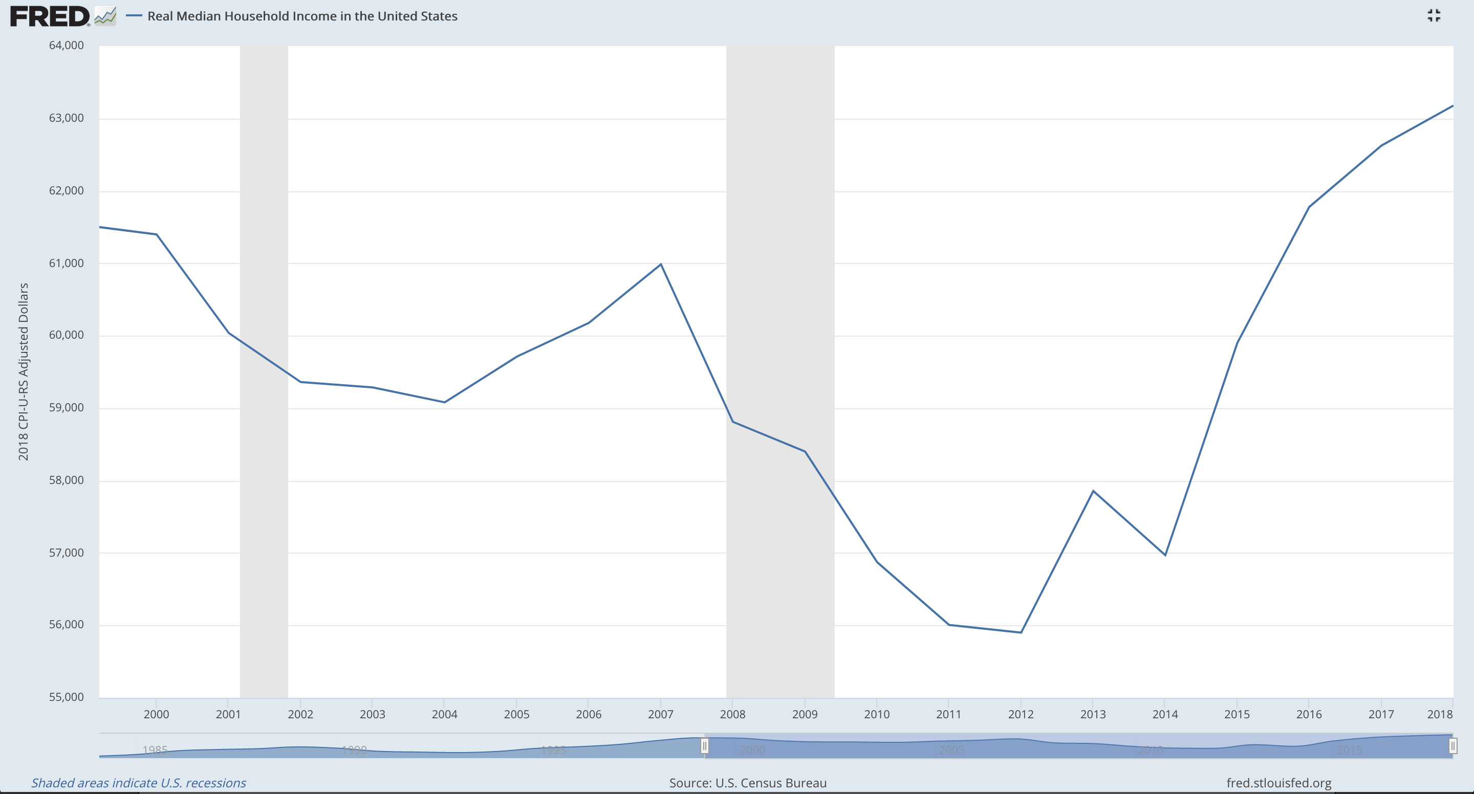
Click chart to enlarge. Source: FRED. Updated annually.
Latest data is for 2018.
Income is the main component of purchasing power. Higher incomes generate higher purchasing power and a stronger economy. The reverse is true.
After an overall decline prior to and throughout the last two recessions from 1999 to 2012, household income levels have recovered to new highs in 2016 and continue to show strong improvement.
At this stage, in early 2020 this data is now too out of date to draw conclusions about the current economic climate.
UNEMPLOYMENT RATE
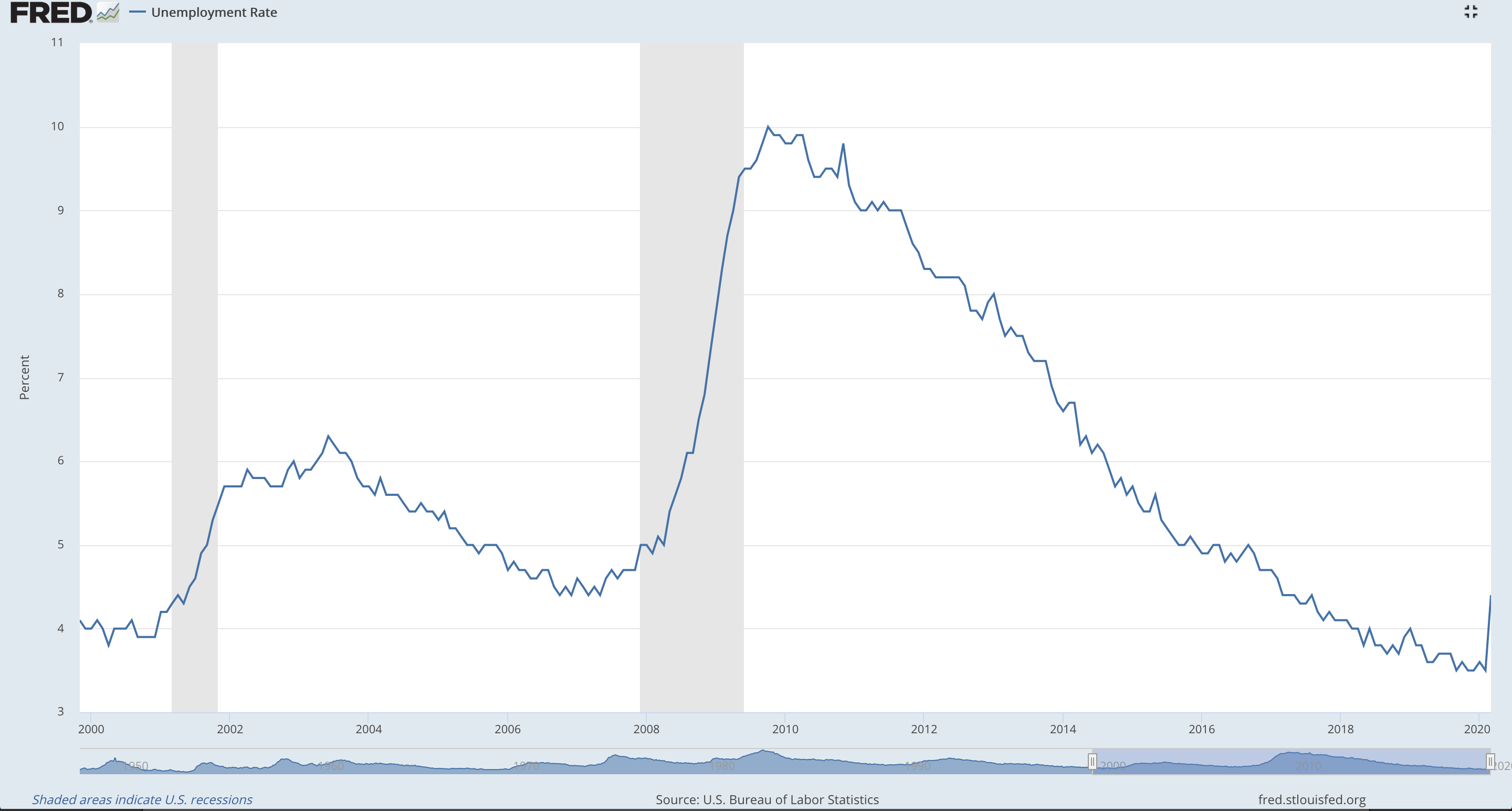
Click chart to enlarge. Source: FRED. Updated monthly.
Latest data is for March 2020.
A decline in unemployment usually means a stronger economy. The reverse is usually true.
Latest available data for March 2020 shows a sharp increase to 4.4%.
INDUSTRIAL PRODUCTION
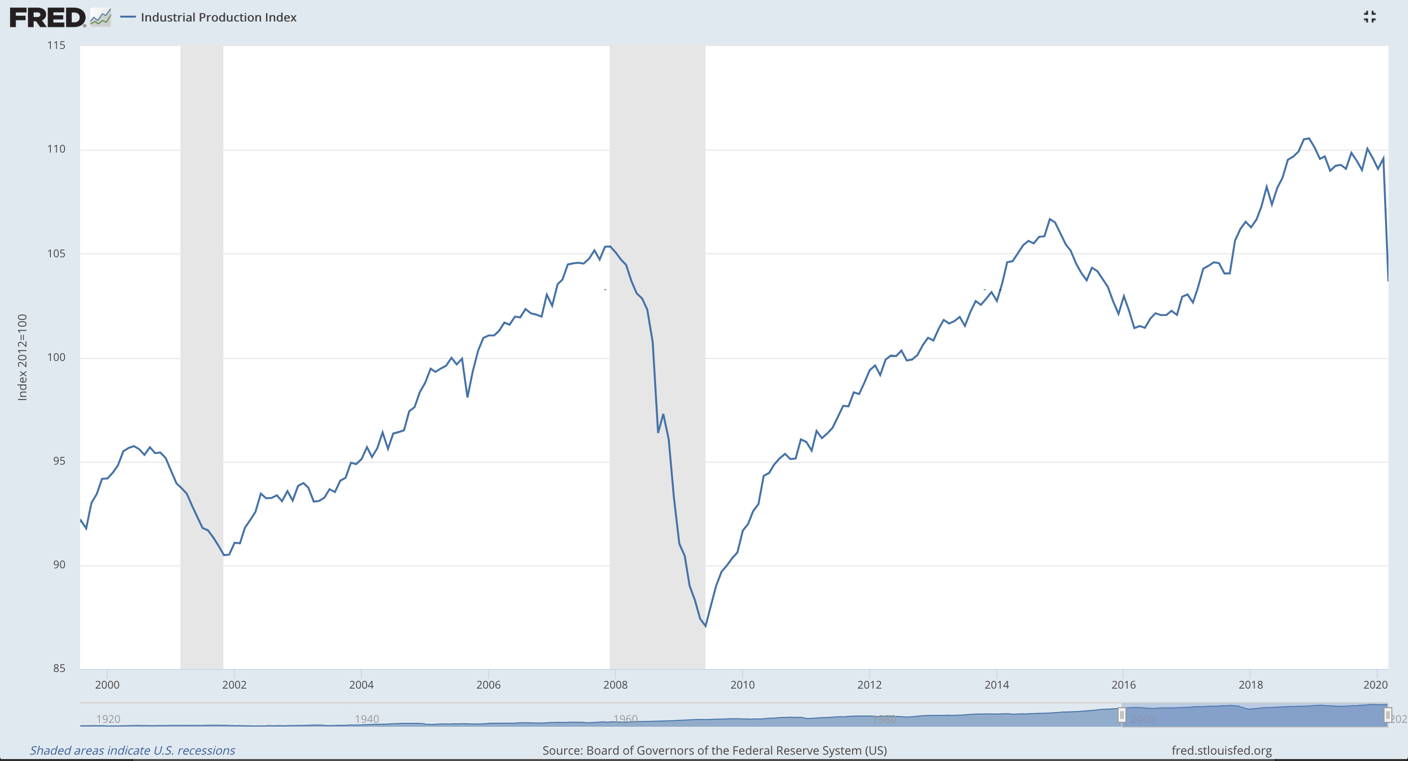
Click chart to enlarge. Source: FRED. Updated monthly.
Latest data is for March 2020.
The industrial production index is an economic indicator that measures real output for all facilities located in the USA: manufacturing, mining, electric and gas utilities. Growth in the index from month to month is an indicator of growth in the industry.
Historic data shows this index always declines throughout a recession, and may occasionally show some small decline prior to a recession. Not all small declines in the index are followed by recessions however.
The peak in industrial production was reached in December 2018. A small shallow decline has now been followed by a sharp decline in March 2020. This suggests a recession may have begun.
REAL MANUFACTURING AND TRADE INDUSTRIES SALES
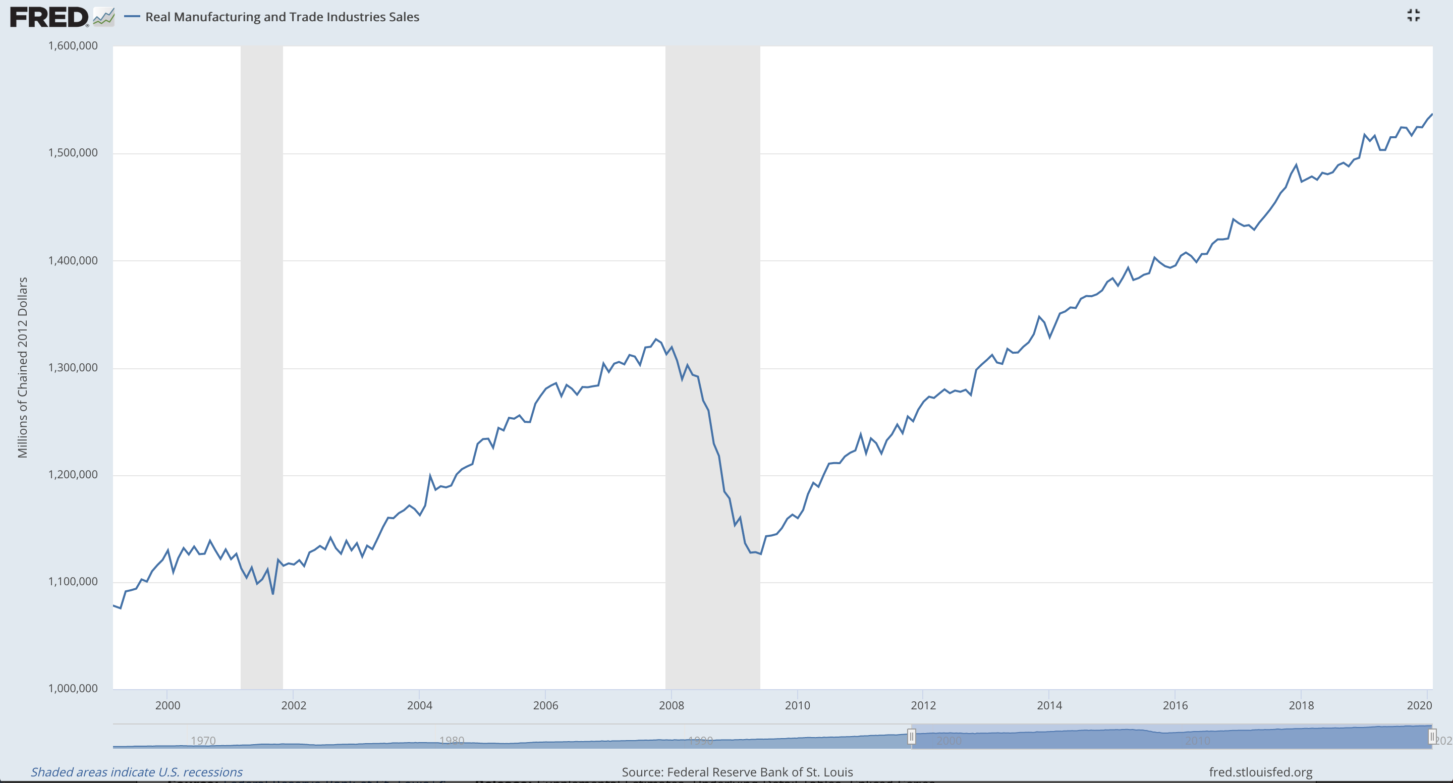
Click chart to enlarge. Source: FRED. Updated monthly.
Latest data is for February 2020.
Generally, strong and increasing sales indicate a strong and increasing economy.
This indicator always declines throughout recessions, and occasionally may decline prior to a recession. Not all declines are followed by recessions however.
Currently, this index is very strong and is at historically high levels. Latest data for February 2020 shows a further increase.
LAGGING INDICATORS
CHANGES IN GDP
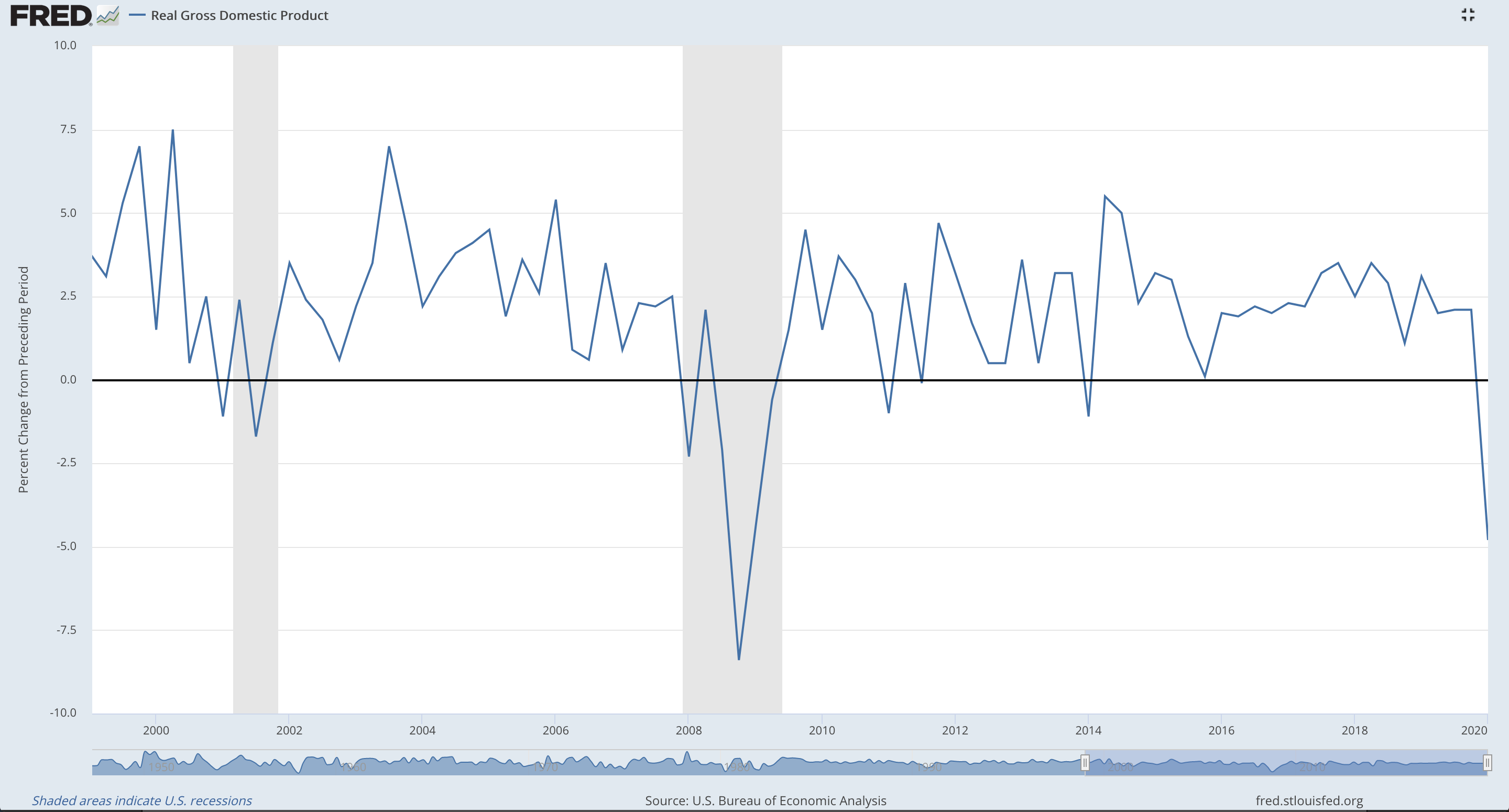
Click chart to enlarge. Source: FRED. Updated quarterly.
Latest data is for Q1 2020.
Changes in GDP usually occur in response to a changing economic climate.
A sharp decline for Q1 2020 indicates the possibility of a recession.
CONSUMER PRICE INDEX

Click chart to enlarge. Source: FRED. Updated monthly.
Latest data is for March 2020.
Core CPI is an aggregate of prices paid by urban consumers for a typical basket of goods, excluding food and energy. Food and energy are excluded because they have very volatile prices. Strongly increasing core CPI may be used to indicate a period of inflation. Strongly declining core CPI may be used to indicate a period of deflation.
Overall, core CPI has shown a steady increase for decades. The last data point for March shows a small decline.
CORPORATE PROFITS
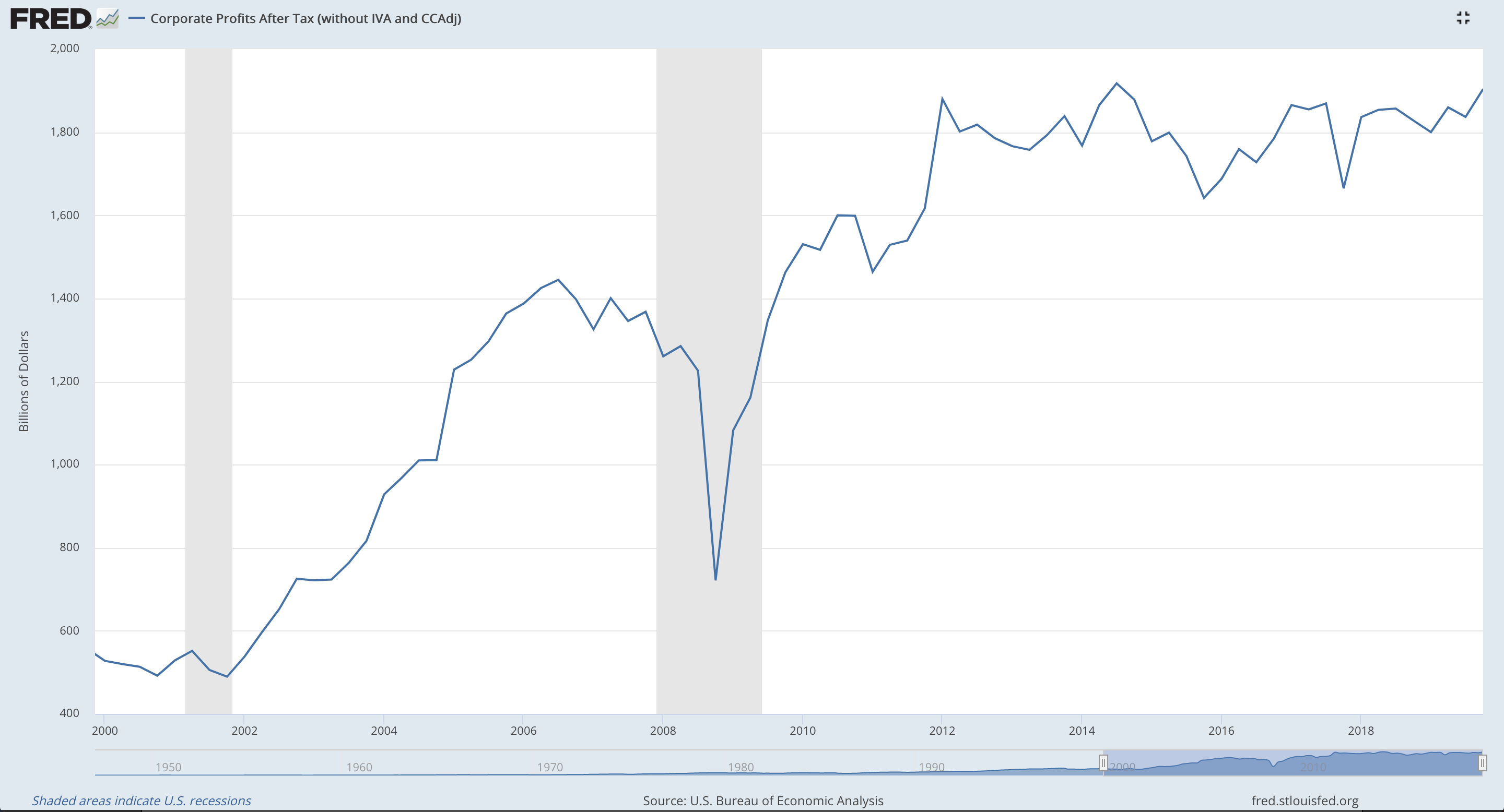
Click chart to enlarge. Source: FRED. Updated quarterly.
Latest data is for Q4 2019.
After tax profits increasing may increase stock market prices as investors buy in and push profits higher
Corporate profits have been holding steady overall, remaining within a range since Q3 2014, and have shown some increase since Q4 2017 within that range.
Latest data for Q4 2019 showed an increase, but levels remained below the prior maximum which was found in Q3 2014.
AVERAGE (MEAN) DURATION OF UNEMPLOYMENT
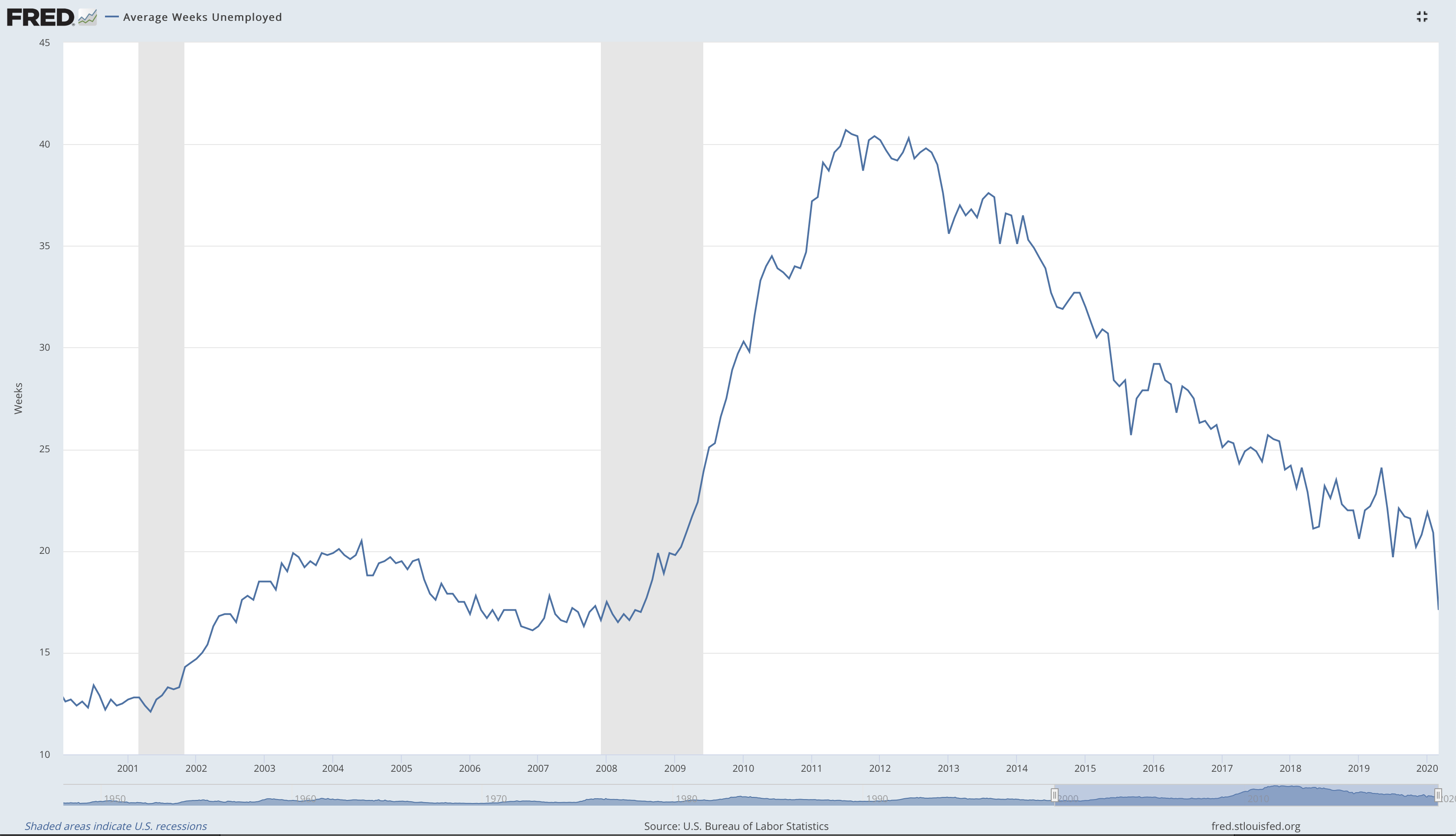
Click chart to enlarge. Source: FRED. Updated monthly.
Latest data is for March 2020.
Declining unemployment duration indicates a strong economy. This indicator lags because employers adjust staff in response to changing economic climates; the adjustment is made after the economy changes
Duration of unemployment has shown a steady decline since its peak in July 2011, with a further sharp decline in March 2020. However, it has not shown to yet decline below prior low levels seen in December 2006.
BALANCE OF TRADE
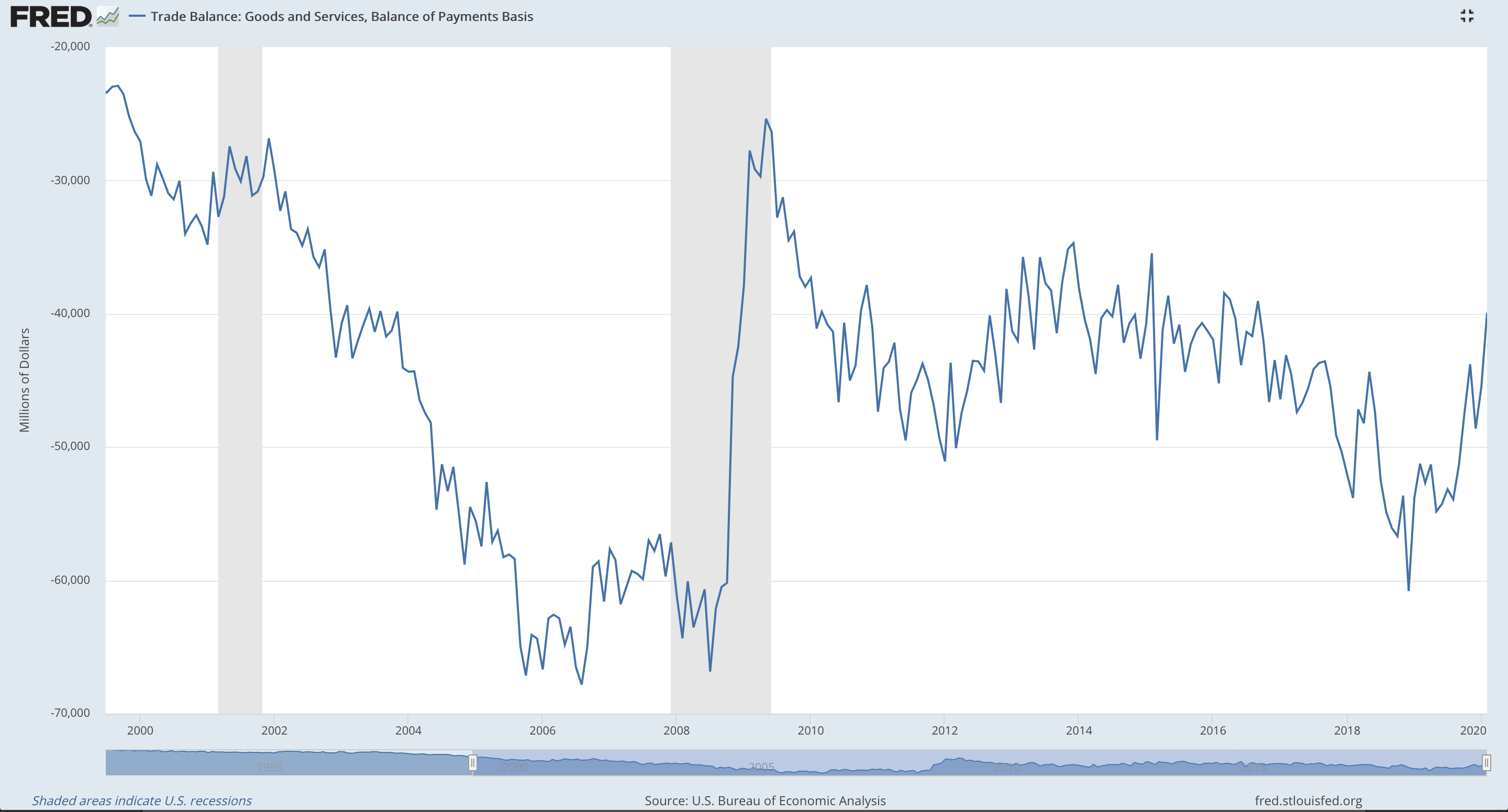
Click chart to enlarge. Source: FRED. Updated monthly.
Latest data is for March 2020.
Generally, trade surpluses are desirable; long term deficits can lead to significant domestic debt. However, there are many different interpretations of this indicator. This data set tends to increase after the start of a recession, and beyond, with a decline during times outside of recessions.
Currently, the Balance of Trade has been steadily increasing since the last low in December 2018.
The Balance of Trade may show some increase as imports decline during periods of recession.
CONCLUSION
Click chart to enlarge.
The following leading indicators show improvement:
Housing Market (data is old, only to 2019)
Consumer Debt (data is old, only to Q4 2019)
Non-farm Hours Worked (data is old, only to Q4 2019)
Interest Rate Yield (recently returned from negative)
The following leading indicators are flat:
Inventory Levels (data is old, only to Q4 2019)
The following leading indicators show a decline or are negative:
Stock Market (data is current)
Retail Sales (data is current)
Household Debt (data is old, only to Q4 2019)
Building Permits (data is current)
Overall, leading indicators show an economy likely in recession. The interest rate yield was negative as recently as early March 2020, which is one of the most reliable leading indicators for a recession. Most recent data is bearish.
Coincident indicators show current economic weakness in increasing unemployment (data is recent) and decreasing industrial production (data is current). The odd one out is increasing manufacturing and trade sales (data is current).
Lagging indicators show an economy which may have entered recession with declining GDP (data is fairly current) and a slight decline in CPI (data is fairly current). The odd one out is a sharp decline in mean duration of unemployment (data is current).
The business cycle may be in early contraction. Sectors which may out perform in the next phase may be UTILITIES, FINANCIAL, and REAL ESTATE.
Click chart to enlarge. Source: FRED. Updated monthly.
The only sector which is lagging and shows a positive slope is ENERGY. FINANCIAL and INDUSTRIALS should be watched closely; if these sectors show a positive slope, they may then present opportunities.