
USDAUD: Elliott Wave and Technical Analysis | Charts – May 14, 2020
This market does not lend itself very well to Elliott wave analysis. Movement is very choppy and overlapping.
Summary: The best Elliott wave count I can find sees the big upwards wave from July 2011 to March 2020 as a counter trend movement. The risk that a major high is in place is high. This has some support from classic analysis at the monthly chart level.
ELLIOTT WAVE COUNT
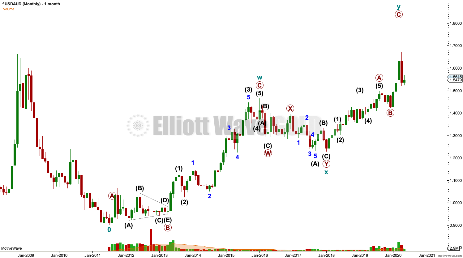
MONTHLY CHART
Click chart to enlarge.
This is the maximum amount of data available from Barchart.
A view of the bigger picture, from Yahoo Finance data, shows higher prices and a downwards trend to the first major swing low on this chart labeled cycle wave 0, which is where this wave count begins.
Fitting this structure into a bigger picture, it expects that the large wave upwards labelled a double zigzag may be an Elliott wave corrective structure. The larger picture for USDAUD may be a downwards trend.
The upwards wave will not fit as an impulse. The conclusion for the bigger picture is this may be a counter trend movement. It will fit well as a double zigzag.
WEEKLY CHART

Click chart to enlarge.
The second zigzag in a double ended with a blow off top. Primary wave B within cycle wave y fits as a running contracting triangle.
An end to cycle wave y would be indicated if price makes a new low below 1.4975. At that stage, downwards movement may not be a fourth wave correction within primary wave C, so primary wave C would most likely be over. This would give confidence in a trend change to downwards.
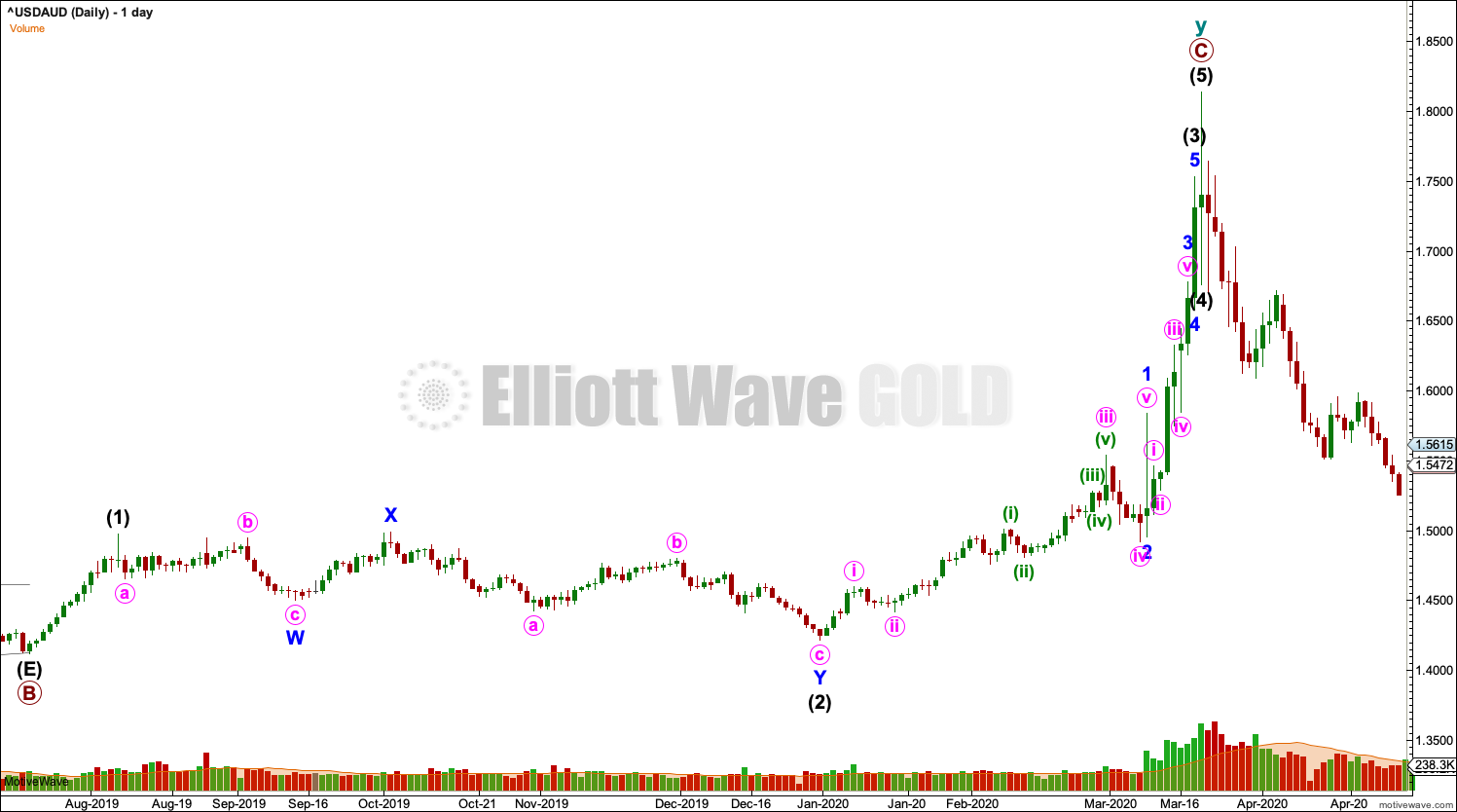
DAILY CHART
Click chart to enlarge.
The daily chart focuses on the structure of primary wave C.
TECHNICAL ANALYSIS
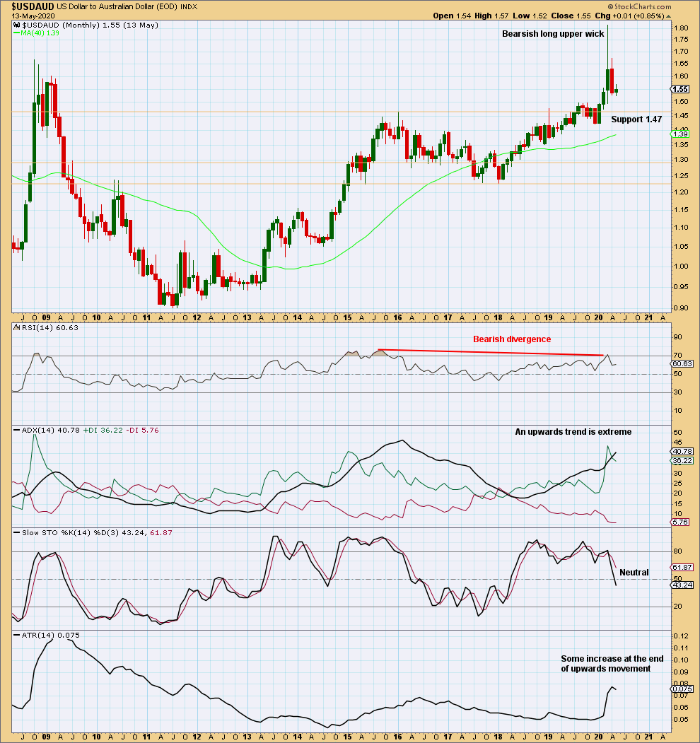
MONTHLY CHART
Click chart to enlarge. Chart courtesy of StockCharts.com.
A long bearish upper wick, with bearish divergence between price and RSI after RSI reached overbought, suggests the risk here of a trend change is high. Support below is identified on the chart.
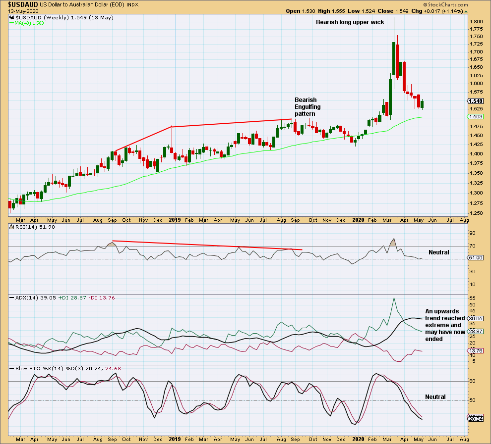
WEEKLY CHART
Click chart to enlarge. Chart courtesy of StockCharts.com.
A very long upper wick suggests a trend change.
Notice the week of the September 3, 2019: That week completed a Bearish Engulfing pattern with long term bearish divergence between price and RSI, yet the resulting downwards movement did not last for long and was not a major trend change. This prior example is a warning that a trend change may be expected, but it makes no comment on how major the next trend may be.
DAILY CHART
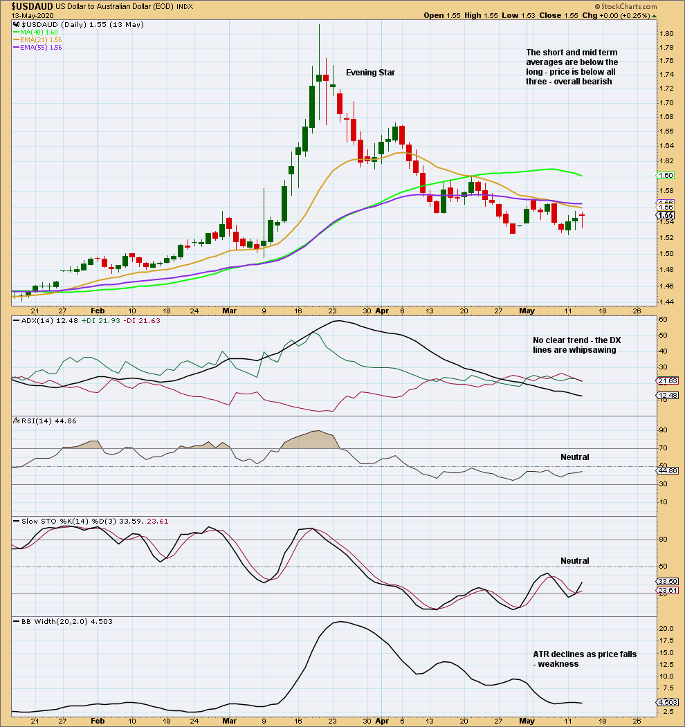
Click chart to enlarge. Chart courtesy of StockCharts.com.
Downwards movement lacks range and is now choppy and overlapping. Look out for signs of a reversal.
Published @ 09:40 a.m. EST.
—
Careful risk management protects your trading account(s).
Follow my two Golden Rules:
1. Always trade with stops.
2. Risk only 1-5% of equity on any one trade.
—
New updates to this analysis are in bold.